INSIGHTS > News & Trends Our Process What’s New Case Study
NCA – National Children’s Alliance
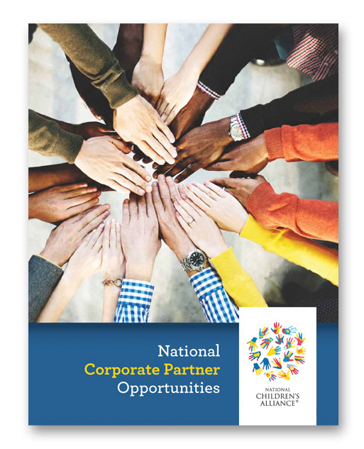
The National Children’s Alliance is an association that serves as a voice for abused children and we’re honored to work with them on their message and branding. We were recently contracted to design a brochure, several flyers, and “partner” logos to increase their membership and support. Their corporate logo (below) was already established, so we focused on branding these materials to stay in line with colors, fonts, and themes. It’s pretty simple, but also apparent that focusing on reds, blues, 2-3 fonts, and hands maintained a consistent and identifiable look.
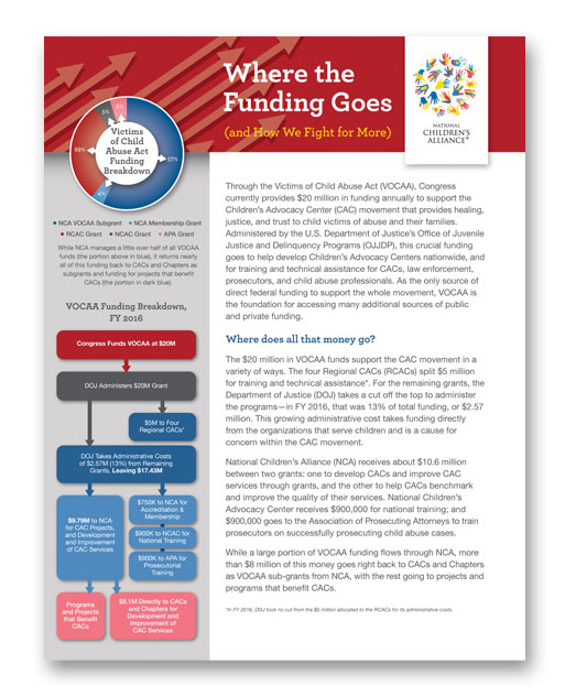
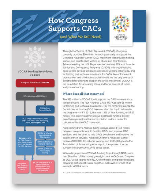
The flyers above depended heavily on effective and eye-catching charts and graphs. We love the task of coming up with unique infographics. It’s like taking a spreadsheet and making it come to life. The two Partner logos are somewhat playful yet corporate. Finding, creating, and manipulating the “perfect” hand was the biggest challenge.

Our most recent and very exciting task was to develop the 2018 Conference theme. As we identified in “Our Process”, we created 3-4 initial comps all focusing on NCA’s suggestion of growth, a flower, the sun. It was a tough decision, but they picked the first one. We will now adapt and incorporate the theme logo to banner ads, email templates, and various conference materials. This is one of our specialties.


