WORK > Logos Collateral Web Design Advertising
Website Design Services
Search Technologies
When we presented initial comps for this homepage, two of the three had that “high tech” feel. Though they were extremely appealing, this literal, yet playful approach had a market uniqueness that stood out from the crowd. That’s typically our objective.
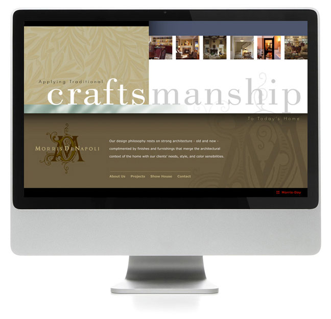
Morris DiNapoli
This site demanded style and an extreme attention to detail. To help capture that detailed aspect, we focused on portions of rooms and drew on a wide range of complimentary colors…tying everything together in a bold and rich layout.
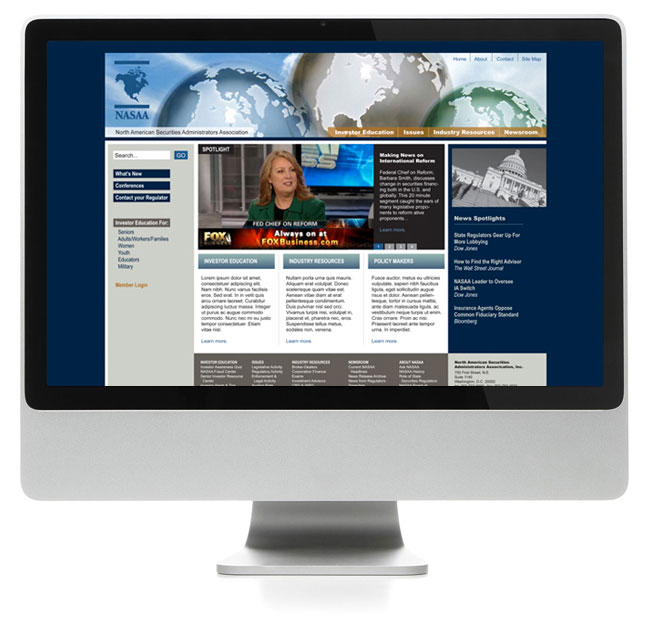
North American Securities Administrators Association (NASAA)
“News and information” – that was the goal of this homepage. Of course, we had to make it look appealing as well. It’s a lot on the eyes at first but basically covers every realm of the entire site all in one place with very little, if any, scrolling required.
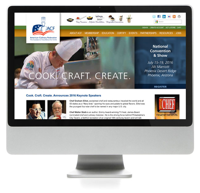
American Culinary Federation
Provided with some captivating “hero” images that rotate at the top, we naturally focused on color and balance to tie everything together while accommodating an extensive navigation, secondary navigation, ads, and content.
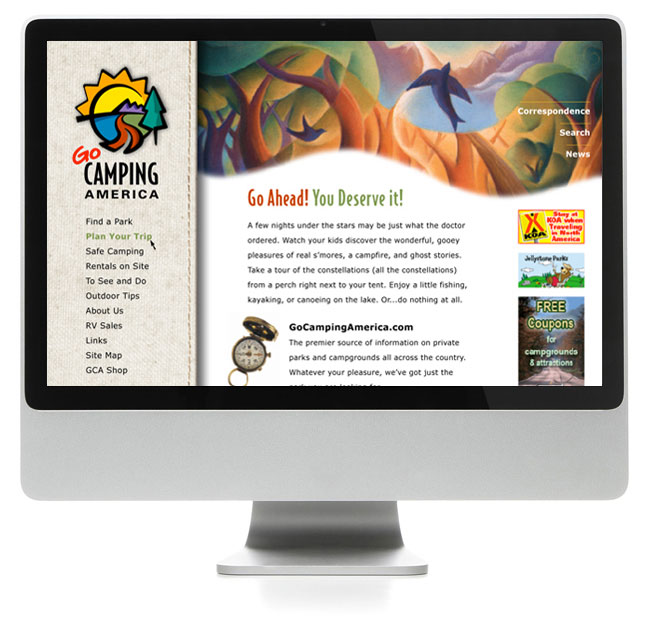
Go Camping America
After designing the logo for Go Camping America, we were given the task of designing their new website. The logo was a challenge incorporating so many aspects of nature into one cohesive icon. Fortunately, we had a larger palette to work on for the site, so we took full advantage of it using an illustration for the masthead, a stitched canvas sidebar, and fun graphics throughout.
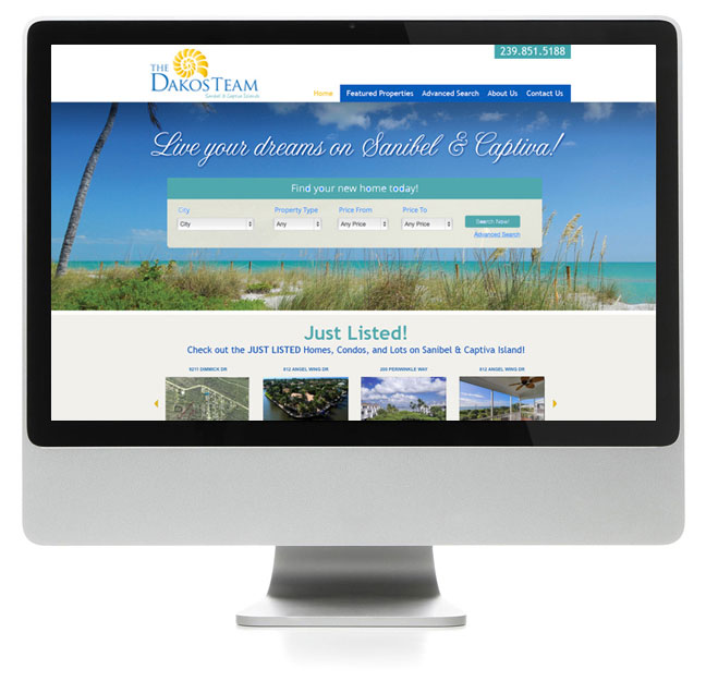
The Dakos Team
Real Estate sites can be rather trendy, instantly showing you the latest houses on the market, whether good, bad, or average. We focused on the beauty of the location. Any residence with a view like this around the corner, or in your own backyard, would be a dream.
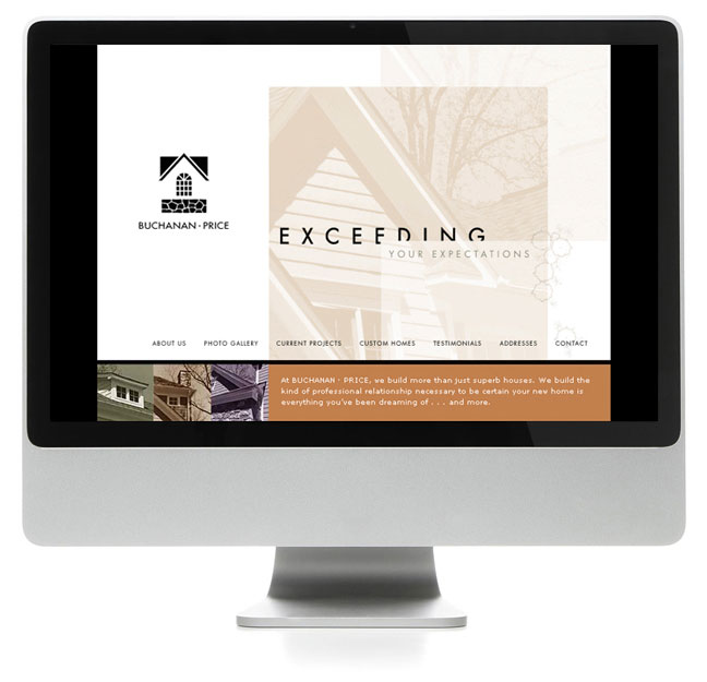
Buchanan Price
Our latest “work in progress” merits a quick sampling. In our tradition of breaking the painfully mundane, template-driven homepage layout, we listed the navigational buttons towards the bottom while leaving the top 80 percent of the page free from distractions in order to give the viewer an opportunity to see what this company has to offer.


