WORK > Logos Collateral Web Design Advertising
Collateral Design Services
Senior Solutions
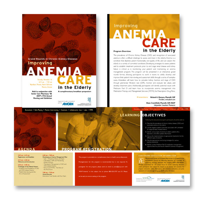
How do you get nurses and physicians interested in attending a seminar? You certainly don’t bore them with textbook visuals and schematics. Keep it simple but engaging. Humanizing this particular piece, captures the “care” aspect.
NTCA
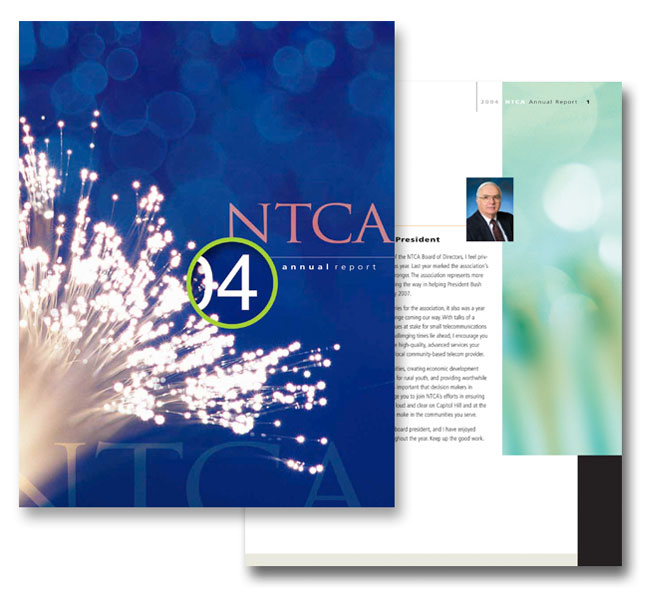
2004 seems like decades ago, but that was the age of fiber optics. Fortunately, annual reports typically have a one year shelf life so the subject matter was very timely. The goal here was to create a dramatic and bold cover but utilize white space for the interior with more abstract splashes of color to tie in with the cover concept.
NEA Member Benefits
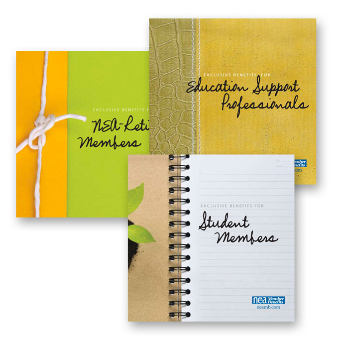
These types of brochures are commonly called “stand-alones” since they are identifiable as a group but are also effective individually (stand alone). These pieces never actually go together as a group though the content is fairly similar. We could have just kept the same design and changed the text, but this was more exciting and easier for the end-user to identify.
Rasika
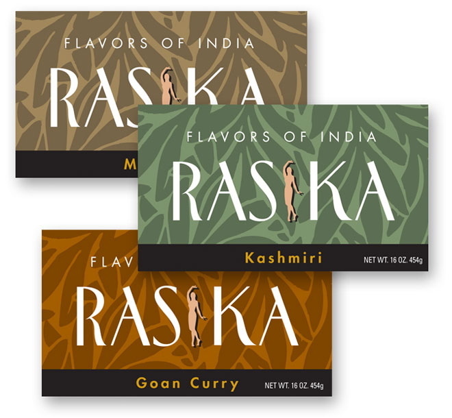
Wow, this stuff is fantastic. Unfortunately, we never had a chance to sample it prior to doing the design but the ingredients and directions for use were appetizing enough to inspire us. Simple and very classy, just like the restaurant.
Immersion Medical
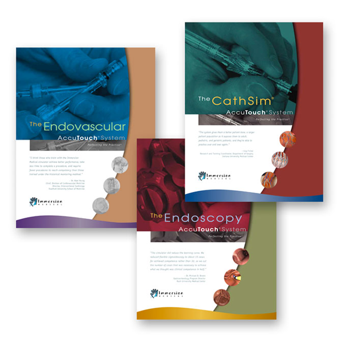
Challenge #1: selling a product that’s already not too glamorous to begin with. Challenge #2: illustrating the product’s ease of use and high end results. Final challenge: doing both while selling a product which isn’t cheap. Incorporating persuasive quotes to the covers completed the all-in-one challenge.
Micah Solomon
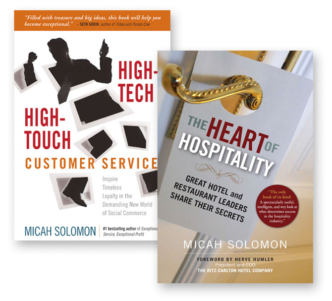
Books are so fun to design. For most, you’re presented with a somewhat small palette, the ever-important title and author which need to stand out, and a testimonial or two. It has to be unique and “pop” while conveying as much visual information as possible, but still maintain a simplicity.
Go RVing
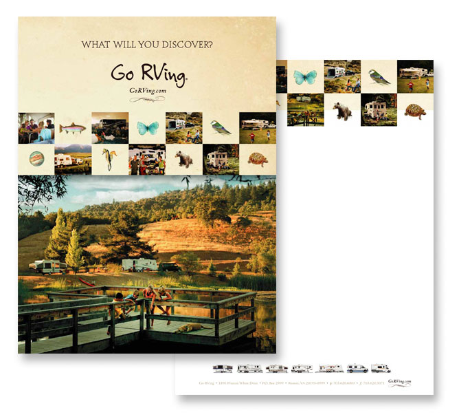
To go in conjunction with their latest national ad campaign, the Go RVing Coalition asked us to come up with a Kit Folder design that captured the essence of what RVing is all about. It was a bit of a challenge to represent all the different models of RVs (Recreation Vehicles) without sacrificing the overall mood, but we had the assistance of some fabulous photography.
Airports Council International – North America (ACI-NA)
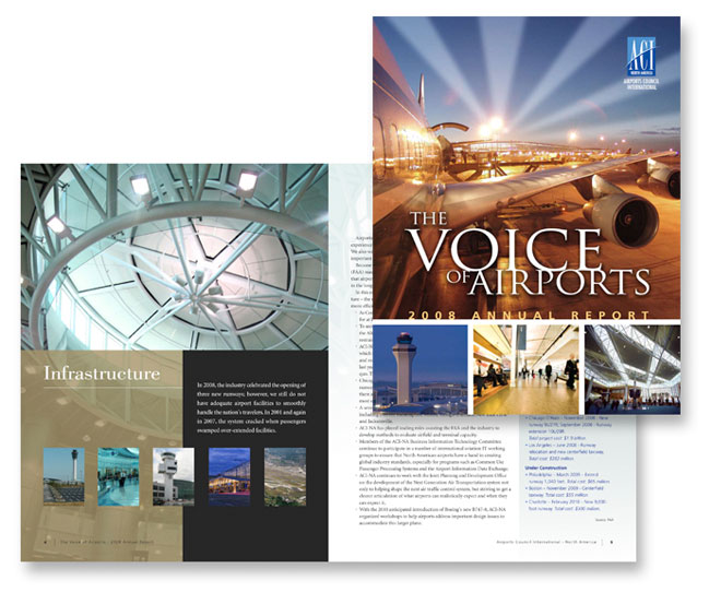
With an abundance of great images to use, we designed this piece to utilize as much as was available to capture the full depth of this association. Many of the left-hand spreads consisted of a photo collage accompanied by a pull quote or fact, leaving the right-hand spread for pertinent information. Basically, a children’s book for adult professionals.
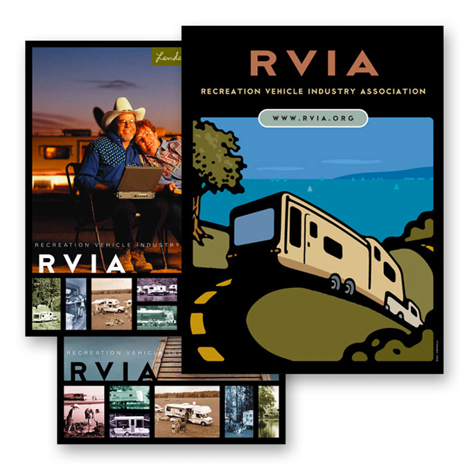
Recreation Vehicle Industry Association
For their most recent kit folder, we suggested to the fine people at the Recreation Vehicle Industry Association to consider an alternative to the typical scenic photograph(s). We went for something with a lot of impact, fun and color. With the assistance of illustrator, Neal Aspinal, we achieved the aforementioned, and then some.
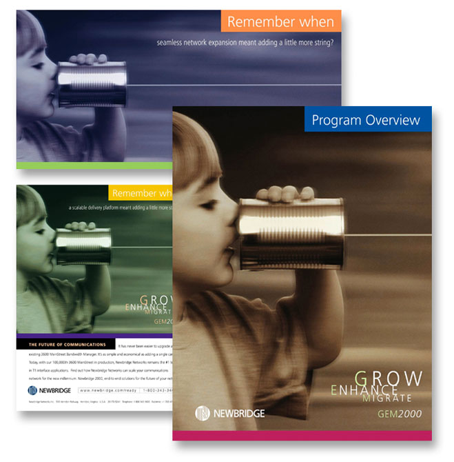
Newbridge Networks
Four-part promotion designed for Newbridge Networks. The challenge was coming up with one image versatile enough to be used as a national ad, an instructional brochure for selling partners, a give-away gimmick for top producers, as well as a direct mail piece designed to bring in potential buyers. Remember when a scalable delivery platform meant adding a little more string?
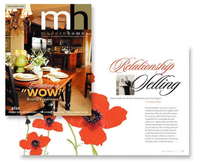
Manufactured Housing Institute
Creating Modern Homes magazine from scratch was a designer’s dream. With no previous format to follow, we were able to give it a unique, stylized and classy feel to help boost the industry and attract advertisers. Though it’s an association publication, it was our intention to give it the appeal of any Better Homes & Gardens type magazine.
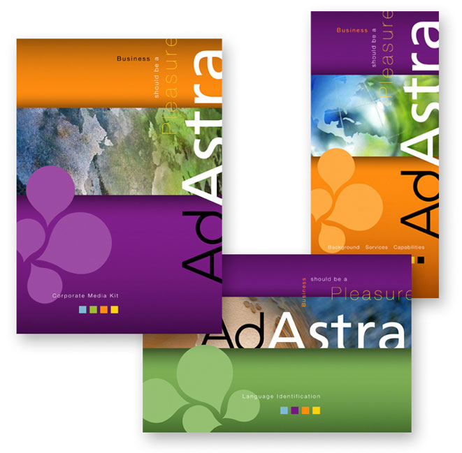
Ad Astra
Language services such as interpretation and translation instantly invoke a sense of “multi-cultural.” Ad Astra’s brand is bright colors (orange, purple, green). We mixed and matched those colors with global surfaces for a complimentary campaign package.
Aarondale
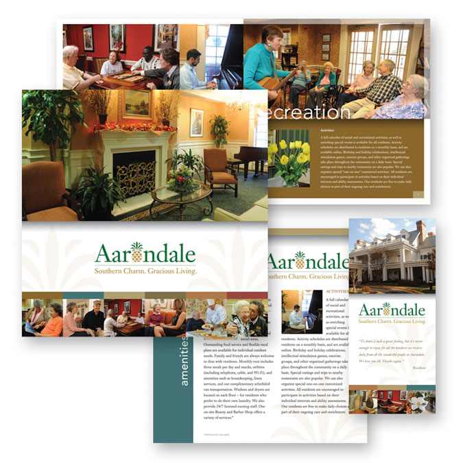
This assisted living facility, the staff, and the residents are nothing but charming. We first designed the logo to give it a welcoming appeal, brought in a photographer to capture the warmth, then tied it all together in a complete, multi-faceted promotional package.
Human Factor
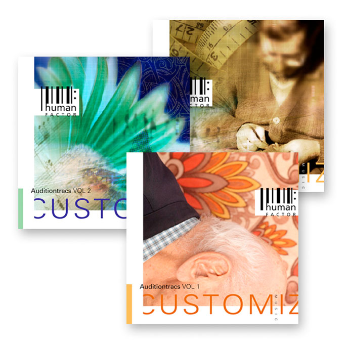
These CD covers are catalogs of music samples for performers to purchase and use for their own music. The equivalent of factory product for the artistically inclined. Portraying a particular style of music was unnecessary since each disc covers many. They’re more of an “alt” library. Each CD cover needed a unique theme and color palette to clearly differentiate one from the next.
NTCA
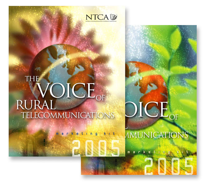
“Rural Telecommunications” almost sounds like an oxymoron but it’s an industry big enough for the need of an association – National Telecommunications Cooperative Association (NTCA). Our job: blend the two visually in a kit folder and marketing manual. The result: a captivating and colorful look to entice potential sponsors and advertising.

