WORK > Logos Collateral Web Design Advertising
Advertising Services
NEA Member Benefits
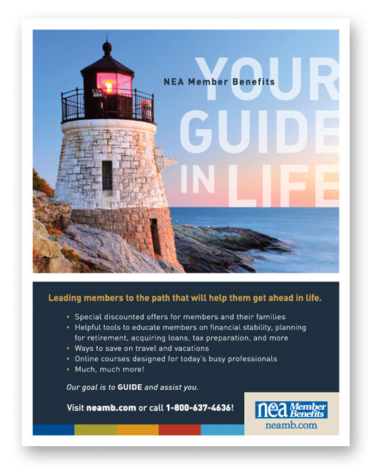
A strong foundation is key to members of any association. Who will be their voice, be there when they are in need, “guide” and assist them? Visual metaphors are common in advertising because people can identify with them with little bias. The goal is to brand that metaphor and make it exclusive.
Resun
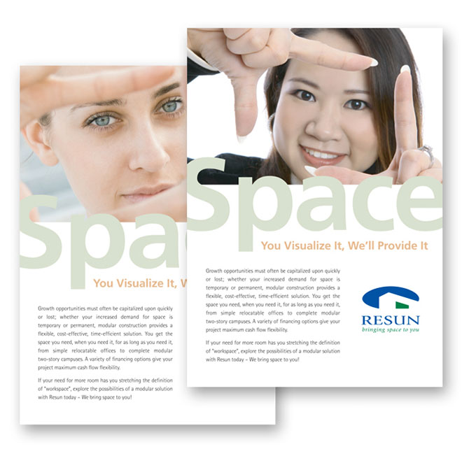
This is the second campaign that we developed for Resun, a modular space distributor. Like before, we kept a “human” element to the concept and focused on the idea of “space.” Tying a photograph of a visual marquee to the bold, single-word title spoke volumes.
Bibiana
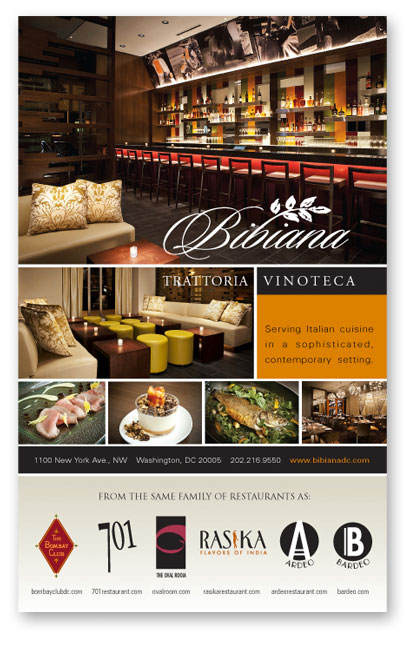
The upscale cuisine of this restaurant sells itself, but it was our job to appeal to those who may be unfamiliar with the decor and atmosphere…a delicate balance of contemporary minimalism that accentuates the fine dining experience. The brown, orange and splash of red, though not the best marketing colors, find and exude harmony.
Newbridge Networks
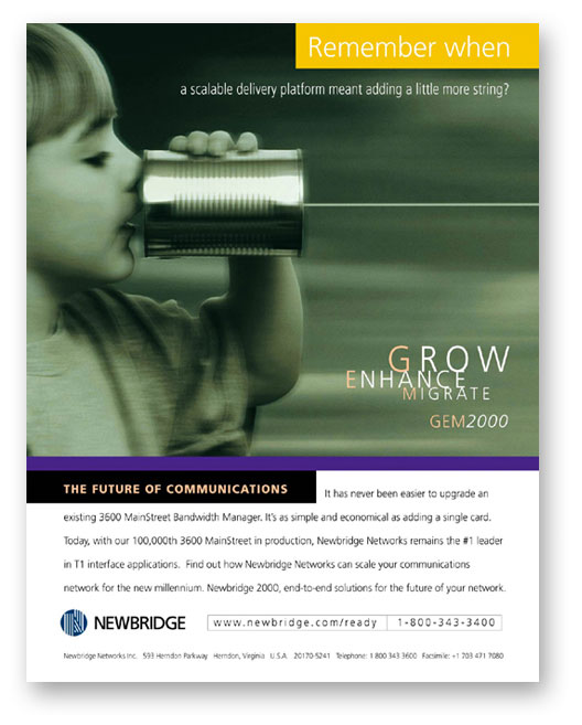
Four-part promotion designed for Newbridge Networks. The challenge was coming up with one image versatile enough to be used as a national ad, an instructional brochure for selling partners, a give-away gimmick for top producers, as well as a direct mail piece designed to bring in potential buyers. Remember when a scalable delivery platform meant adding a little more string?
Sallie Mae
Yes, we also have fun doing our job. Why just show a picture of money when there’s also a point and message to get across to your audience… and a client who wishes to be recognized for their charitable contributions.

